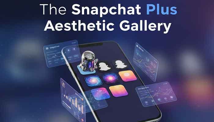
Hey there! I’m Martin. If you’re anything like me, you probably spend a little too much time making sure your phone’s aesthetic is just right. I’m the kind of guy who will spend forty-five minutes picking the perfect wallpaper only to realize my app icons totally clash with the vibe.
For a long time, Snapchat was just that one bright yellow square that stuck out like a sore thumb. But then Snapchat Plus custom icons dropped, and honestly? It changed the game for those of us who obsess over our home screen layouts. Today, I’m going to walk you through every nook and cranny of this feature so you can stop settling for “default yellow” and start expressing yourself.
My Personal Experience with Snapchat Plus Custom Icons
I remember exactly when I decided to pull the trigger on a Snapchat+ subscription. It was a rainy Tuesday, and I was looking at my “Space Minimalist” home screen theme. I had these deep navy widgets and sleek white icons for everything—except Snapchat. That neon yellow ghost was staring back at me like a strobe light in a library.
I’d seen some friends rocking a cool planet themed icon, and I finally thought, “Okay, Martin, let’s see if this is worth the monthly coffee price.” I went into the settings, toggled the icon to the ‘Mars’ theme, and suddenly, my home screen felt… complete.
But it wasn’t just about the first icon I picked. I actually ran into a bit of a snag. I changed my icon, but the notification badge seemed to lag, or I’d forget which icon was actually Snapchat because I’d changed it to something so abstract! Through a week of trial and error, I figured out which designs actually pop and which ones just get lost in the shuffle. I learned that while “aesthetic” is the goal, “findability” is the secret sauce.
Read More: Why Did My Snapchat Planet Rank dropped From Mercury to Venus?
What Exactly are Snapchat Plus Custom Icons?
Before we dive into the gallery, let’s get the basics down. If you aren’t a subscriber yet, you might be wondering what the hype is about. Snapchat Plus is a premium tier that gives you experimental and pre-release features. One of the “crown jewels” for design nerds is the ability to swap the standard ghost logo for dozens of different styles.
We’re talking everything from metallic finishes to pride flags, and my personal favorite: the planet themed icons. These aren’t just simple color swaps; they are completely redesigned graphics that sit on your home screen.
Why Bother Changing It?
- Home Screen Cohesion: Match your icon to your wallpaper.
- Subtle Flex: It shows you’re part of the “Plus” club.
- Mood Matching: Change it based on the season or your current vibe.
How to Change Your App Icon: A Quick Tutorial
I’ve had a few friends ask me, “Martin, I bought the sub, but where the heck is the setting?” It’s actually tucked away a bit. Here is the change app icon tutorial I give everyone:
- Open Snapchat and tap your Bitmoji in the top left corner.
- Look for the Snapchat+ membership card (it’s usually right below your name). Tap it.
- Scroll down until you see App Icon. Tap that.
- Browse the gallery! You’ll see categories like “Classic,” “Exclusive,” and “Decor.”
- Select your favorite. A pop-up will ask for permission to change the icon (on iOS). Hit “OK,” and boom—you’re refreshed.
Martin’s Pro-Tip: If the icon doesn’t update immediately, don’t panic. Sometimes you need to restart your phone or just wait sixty seconds for the system cache to catch up. I thought I broke my phone the first time it didn’t change instantly!
The Aesthetic Gallery: Breaking Down the Styles
When you open that icon menu, it can be overwhelming. There are dozens of choices. Let’s break them down by “vibe” so you can find yours.
1. The Planet Series (The Fan Favorite)
The planet themed icons are easily the most popular. They take the ghost silhouette and fill it with textures representing different celestial bodies.
- Earth: Great for a green/blue “nature” theme.
- Mars: Perfect for dark mode users who want a pop of red.
- Saturn: Very “lo-fi” and chill.
2. The Chrome and Metallic Collection
If you like a “techy” or futuristic look, these are for you. They have a 3D sheen that makes the icon look like a physical piece of jewelry on your screen.
- Silver Chrome: Matches almost any wallpaper.
- Rose Gold: Essential for that “clean girl” or “minimalist chic” aesthetic.
3. Patterned and Artistic Icons
Sometimes you want something a bit more “out there.”
- Checkered: Very 90s skate culture.
- Floral: Great for spring vibes.
- Pride: Show your colors with various flag-themed ghosts.
Comparing the Best Snapchat Plus Icon Styles
To help you decide, I’ve put together this quick comparison table based on my own testing.
| Icon Category | Best For… | “Martin’s” Vibe Rating | Visibility on Dark Wallpaper |
| Planet Themes | Science & Space Nerds | 10/10 | High |
| Monochrome | Minimalists | 8/10 | Medium |
| Neon Glitch | Gamers/Night Owls | 9/10 | Extremely High |
| Seasonal/Holiday | Festive People | 7/10 | High |
| Classic Gold | Luxury Feel | 8/10 | High |
Why An “Aesthetic Snapchat” Matters in 2026
You might think, “Martin, it’s just an icon. Why does it matter?” Well, we look at our phones hundreds of times a day. Digital clutter is real. When your apps are a mess of clashing colors, it creates a tiny bit of “visual friction.”
Creating an aesthetic snapchat experience—where the icon, your Bitmoji background, and even your chat wallpaper all match—makes using the app feel more personal. It’s like decorating your room. Sure, you can sleep in a room with bare white walls, but doesn’t it feel better with some art?
The “Hidden” Psychology of Icon Colors
- Blue/Purple icons (like the Neptune planet icon) tend to feel more calming.
- Red/Orange icons (like the Sun icon) are easier to find when you’re in a rush because our eyes are drawn to those wavelengths.
- Black/White icons reduce “distraction” and might actually help you spend less time mindlessly clicking on the app.
Troubleshooting: Why Won’t My Icon Change?
Honestly, this part confused me at first. I’d select an icon, and nothing would happen. If you’re running into issues with your Snapchat Plus custom icons, check these three things:
- Subscription Status: Is your Plus subscription still active? If it lapses, the icon reverts to yellow immediately. (Found that out the hard way when my credit card expired!)
- OS Updates: If you’re on an ancient version of iOS or Android, the “custom icon” API might be buggy. Update your phone!
- The “Ghost” Reset: Sometimes the icon changes in the app but not on the home screen. Try removing the app from your home screen (don’t delete it!) and dragging it back from your App Library.

Frequently Asked Questions (The Reddit Deep Dive)
1. Does the custom icon change for my friends too?
Nope! This is purely for your own home screen. Your friends will still see your Bitmoji or the standard ghost when they look at your profile, unless you’ve changed your “Friend Solar System” settings, but that’s a different story!
2. Can I upload my own photo as a Snapchat icon?
As of right now, no. You have to choose from the official gallery provided by Snapchat. I know, I’d love to put a picture of my dog there too, but for now, we’re limited to their (admittedly very cool) designs.
3. Will I lose my custom icon if I cancel Snapchat Plus?
Yes. The moment your subscription ends, your icon will turn back into the classic yellow and white. It’s a “rented” aesthetic, unfortunately.
4. Are there any “hidden” icons?
Snapchat occasionally drops limited-time icons for events (like Halloween or New Year’s). Keep an eye on the “Exclusive” section of the icon gallery during holidays!
5. Do these icons work on both Android and iOS?
Yes! While the way the phone handles the change is slightly different (iOS asks for a confirmation, Android usually just does it), the feature is available on both platforms for Plus subscribers.
Advanced Customization: Going Beyond the Icon
If you really want that aesthetic snapchat look, don’t stop at the icon. Martin’s secret move? Match your Chat Wallpaper and your App Theme to the icon.
- The “Deep Space” Look: Use the Saturn icon, a black-and-purple chat wallpaper, and enable “Always Dark” mode in the settings.
- The “Sunset” Look: Use the “Horizon” icon (pink/orange gradient) and match it with a warm-toned Bitmoji background.
Have you ever looked at someone else’s phone and thought, “Wow, how did they get it to look like that?” This is how. It’s all about the layers!
Martin’s Final Tip
If you’re on the fence about Snapchat Plus, I’d say give it a one-month trial just to play with the icons. But here is my Golden Rule: Don’t pick an icon that is too different from the original color if you’re a heavy user. I once picked a dark grey icon and kept “losing” the app on my home screen because my brain was hard-wired to look for yellow. If you find yourself hunting for the app, try one of the yellow-tinted custom icons first!
So, which icon are you rocking right now? Or are you still a “Classic Yellow” purist? Let me know!
Would you like me to show you how to customize your Snapchat Solar System or explain what those planet rankings actually mean next?


